Making the first impression is important because if you show up for your job interview late, your interviewee is going to need lots of good reasons to hire you.
In customer service, making the first impression matters too. This is why sending a welcome email is highly important as soon as you onboard a customer.
A welcome email is a friendly message you send to your customers to encourage them to interact with your business or product/service. If you do the job well, you can boost the chances of customer retention.
This email must be informative, clear, and actionable. Struggling with creating a nice welcome email for your customers? We have got your back.
Here are 10 welcome email templates you can take inspiration from.
Some might work well for your business and some you might have to tweak. Without further ado, let’s begin.
Stealth Agents can further support your efforts with their virtual assistant experts, ensuring your business excels in connecting with and retaining customers.
Discover the e-commerce virtual assistant and its various pricing options and reserve your spot for a free consultation by booking online now.
Welcome email templates samples you can take inspo from
Allbrids
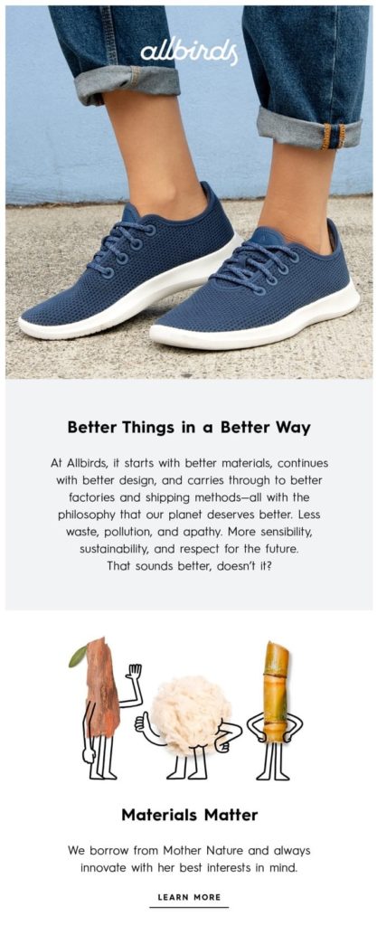
Once you sign up with Allbrids, the shoe brand, you will receive a welcome email that uses colors to convey value, images, and GIFs and a subject line that says “Welcome to the flock.”
The CTA added in the email encourages you to land on their website. Here is what their welcome email looks like:
Canva
Canva’s welcome email has a simple subject line. It starts with “welcome to Canva.”
When it comes to design, they have done a great job. The email guides a first-time user through the steps of getting started with their platform. There is an excellent use of white space and a brightly colored call to action.
Here is what the welcome email looks like:

Grammarly
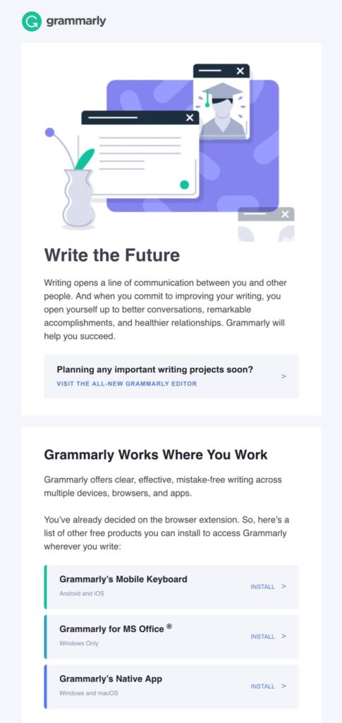
Everyone’s favorite writing assistant, Grammarly’s welcome email is a great inspiration. They have used the power of a friendly and consistent tone to nail everything.
Have a look at their welcome email template:
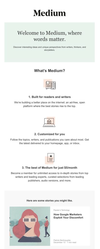
Medium
Medium has kept everything simple. It greets the new members with a light email design created with pastel colors. They have used simple yet powerful statements explaining who the platform is for, the primary idea behind its creation, and how to get unlimited access.
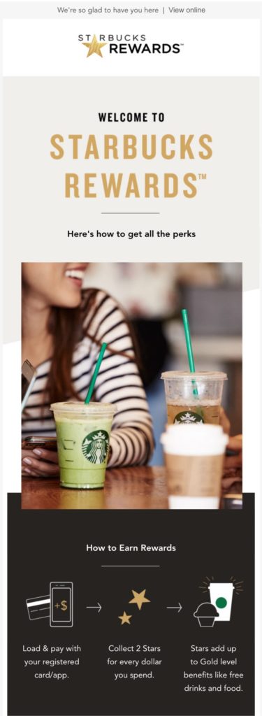
Starbucks
Who doesn’t know this brand for its effective marketing? Their welcome email is just perfect. It quickly encourages the user to join the Starbucks reward program.
The beautiful visuals align with the message. Interestingly, this welcome email doesn’t’ have a clear CTA. Maybe they wanted to keep it informative only.
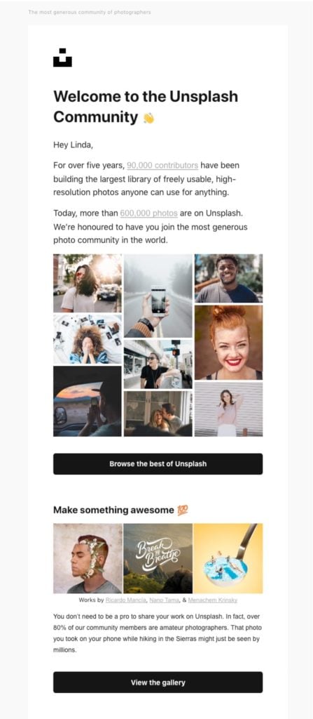
Unsplash
Unsplash starts its welcome email with a short brand story and then begins explaining how its app works.
This shows that real-life narratives help you connect with your customers so well.
They have done a great job using value propositions and wrapping them around the email’s content. In the end, there is a CTA to view their gallery.
IKEA
IKEA uses a personalized subject line to greet its customers upon joining the IKEA family. They use the subscriber’s name throughout the welcome message, which makes it much friendly and even builds trust.
The design, as well as CTAs, focus on the benefits of joining the IKEA family. Plus, they have used visuals to trigger an emotional response.

Masterclass
Masterclass welcome email is one of those welcome email templates that has used CTA as the attention-grabbing element. All CTAs are in red. They have placed one CTA at the beginning of the email to boost the click-through rate. To balance the design, a black background is used with white text.

Shopify
Shopify has nailed it when it comes to CTAs. The email is designed for new store owners who have taken the first steps of joining the eCommerce landscape.
The welcome email has a personalized subject line (user name, as well as the name of your Shopify store, is included).
Throughout the email, you will find multiple CTAs including Shopify’s button in purple. They have even included social proof for building trust with the brand.

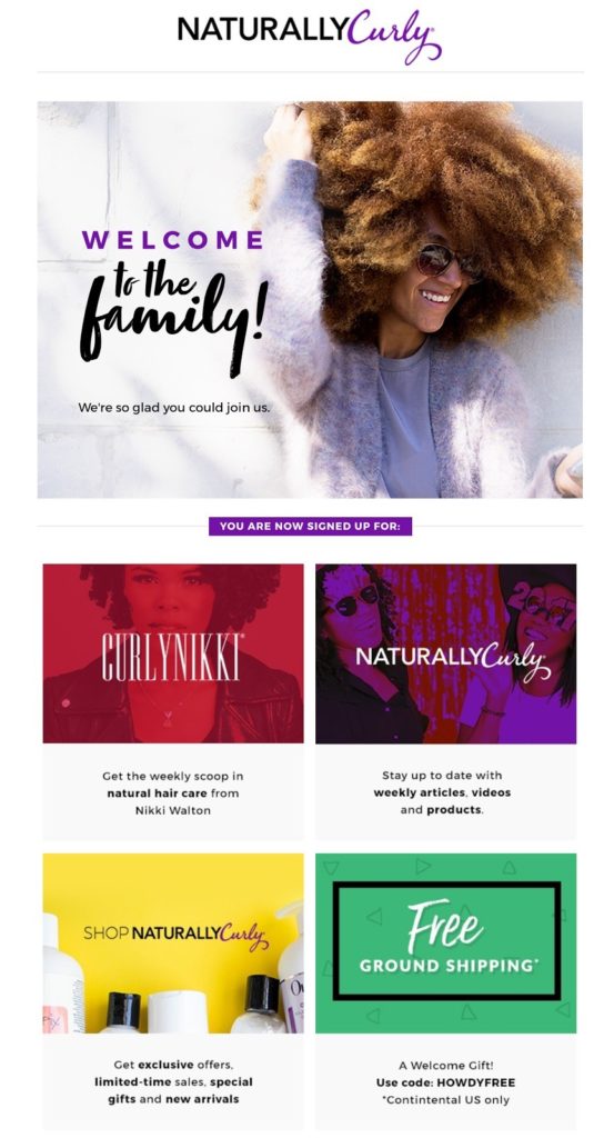
Naturally Curly
Naturally, Curly not only welcomes its customers but also offers them a freebie/discount or incentive in exchange for giving your email address.
There are multiple CTA throughout the email, which is short, crisp, and visual-based. Have a look:
Now that you have had some inspiration by looking at these welcome email templates, let’s help you out in crafting your brand’s welcome email. Read on for the juicy stuff.
Tips for Writing Compelling Welcome Emails
Welcome emails are similar to online dating. You sign up because you like what you see. Now, to make the relationship work, it’s time to deliver what your profile said. Here are some ways you can nail the welcome email:
Start with a simple yet captivating subject line
When it comes to emails, no matter what type they are, a subject line is highly important. A subscriber will only open your email if they find the subject line catchy or interesting. Normally, customers open and read welcome emails because they expect to receive them as soon as they sign up. This also means you must send the welcome email as soon as a customer signs up to boost the chances of getting read.
Welcome emails often contain information or a guide, which is why it’s likely to be read. So, make sure you nail the content, design, and layout. And don’t forget CTAs.
Say thank you
Always thank your subscriber for opting in to receive emails. This can be done via text or graphics.
Include a clear CTA
When sending out a welcome email, adding CTAs is a must. However, be careful with where you place them and how many. Don’t give your new customers a laundry list of things to do. Two to three actions per email do the work.
Make sure the CTAs are loud and clear. After all, the goal of the welcome email is to make a subscriber complete actions they must perform after signing up.
Don’t send too many emails
Some brands send a series of welcome emails. While it’s acceptable to send one or two emails bombarding the subscriber’s inbox with too many emails is not recommended.
A new customer will feel overwhelmed by receiving too many emails. They might as well find it annoying. Therefore, it’s best to condense the information you would like to send into a single email. If you must send separate emails, spread them out over 2 days. This way, the customer won’t feel annoyed.
Include a product demo
A welcome email is a great opportunity to introduce a new customer to your product or service. Take the example of the Canvas welcome email. Using simple steps, they are walking the new customer through the product and how to create their first graphic.
Don’t assume that the customer must have done thorough research before signing up for your product. Yes, they have done preliminary research but most customers still need guidance. What if they sign up for your product but end up quitting because they didn’t understand how to use it? To make sure this doesn’t happen, include steps, product demos, or videos on how to use your product.
You can also encourage the customer to sign up for sessions so that they can learn how to use your product successfully. Take personalization to the next level by demonstrating the value of your product.
Pay attention to the design
You might be doing everything right – a catchy subject line and a wonderful email body but if the design is too bold, flashy, or unappealing, you are driving a customer away. You can ask your graphic virtual assistant or even a Canva virtual assistant to keep an eye on it.
A good email design is one that contains:
Easy to read the text
Keep the fonts simple. You can annoy a customer by using complicated fonts.
Colors that stand out
Stick to your brand colors and don’t overdo them. A minimalist display works wonders all the time.
Keep the flow intact
The message of the email must be broken into sections using white space, text, video, images, and CTA buttons.
Bright CTAs
Speaking of CTAs, use bright colors for adding CTA buttons so that they aren’t missed.
Crafting an email layout doesn’t have to be rocket science. With these tips, create different sample layouts, try and test them within your team, and pick the one that resonates with your welcome message as well as brand the best.
Drive some action
While it’s great to welcome your customers, don’t forget that the purpose of sending a welcome email is to drive action.
After all, what’s the point of giving so much information to a user just to make them click open the email and forget about you? This welcome email must be the first step to start a conversation and build trust.
Therefore, encourage the reader to perform actions. You can also highlight the benefits of keeping in touch with your brand so that the customer keeps coming back for more.
Takeaways
Hopefully, these welcome email templates must have given you a good idea of how to greet a new customer and make them act.
What are you waiting for? Get on with writing your welcome email today!

